Nomis Solutions
Brand Guide
This guide provides the tools and standards to ensure the Nomis identity is applied consistently across all touchpoints. From logo usage to typography and color, these guidelines help us present a unified & professional brand—everywhere Nomis shows up.
The core of our brand
Our Logo Suite
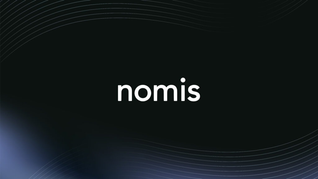
Word Mark
The Nomis wordmark has been refined and strengthened to stand on its own as a core brand asset. This will be our primary logo to be used as it conveys precision and modernity. Please use this logo as the first choice to all internal materials, branding & collateral.
Only set it in the following approved colorways.
Word Mark Black
Word Mark White
Word Mark Blue
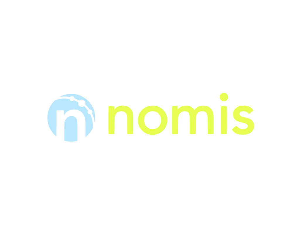
Word Mark Lime
Word Mark Sky Blue
Word Mark Gray
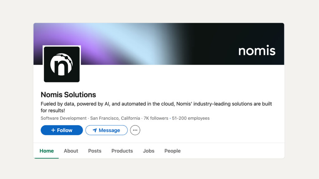
Icon
The Nomis icon is a bold, simplified mark built around the lowercase n, framed within a circular shape with three nodes connected to each other to symbolize data flow and insights.
The icon serves as a compact, versatile expression of the brand, easily recognizable even at small sizes. It is ideal for use in contexts where space is limited or where a strong, symbolic presence is preferred—such as app icons, social media avatars, or favicons.
Icon Black
Icon White
Icon Blue
Icon Lime
Icon Sky Blue
Icon Gray
Horizontal Mark
The horizontal logo pairs the Nomis icon with the wordmark in a clean, side-by-side layout, and should be used when horizontal space is available and clear, balanced legibility is needed—such as on websites, emails, and presentations.
Combo Horizontal Black
Combo Horizontal White
Combo Horizontal Blue
Combo Horizontal Lime
Combo Horizontal Sky Blue
Combo Horizontal Gray
Veritcal Mark
While the logo itself has not changed, we refined the relationship between the icon and the wordmark. In the updated lockup, the proportions have been carefully adjusted—resulting in a slightly larger icon relative to the text. This subtle change enhances balance, legibility, and brand presence across both digital and print applications.
Combo Vertical Black
Combo Vertical White
Combo Vertical Blue
Combo Vertical Lime
Combo Vertical Sky Blue
Combo Vertical Gray
our logo
Usage
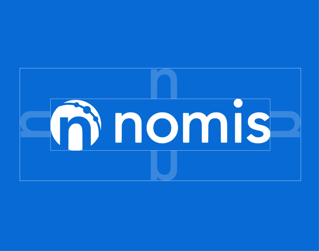
Safe Space
When displaying any of the logo variations, maintain ample space around it to avoid crowding or interference from other elements. To achieve this, don’t place anything within the “safe space” equivalent to the height of the "n" of the logo.
*Exceptions: Subtle patterns or textures overlapping at 20% opacity or less are acceptable.
Please Don't
Use unapproved color combinations or colors

Distort the logo and elements
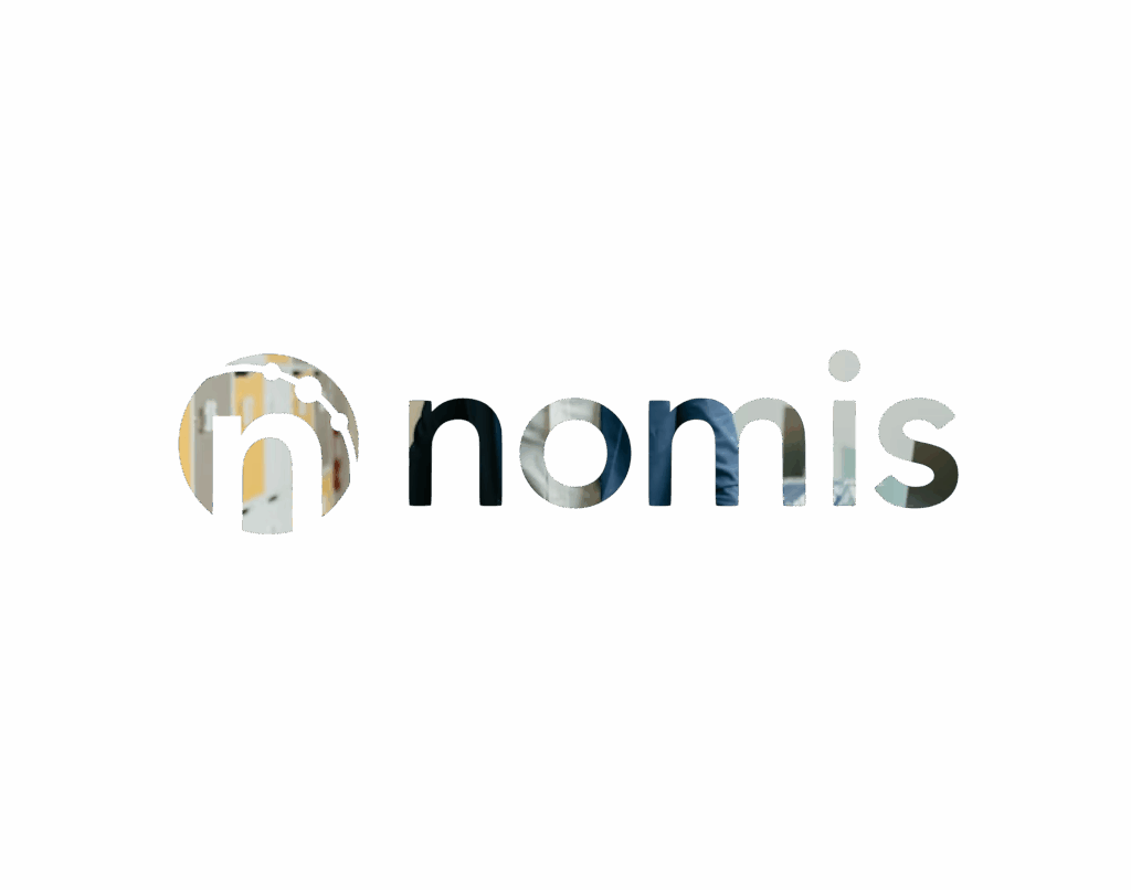
Mask images into the logo
Place on backgrounds that make elements hard to read

Use alt fonts
Nomis in
Color
Primary Colors
Foundation Black
- Hex #0d1311
- RGB 13, 19, 17
- CMYK 76, 65, 67, 82
- Pantone Black 6 C
Nomis Blue
- Hex #086ad4
- RGB 8, 106, 212
- CMYK 87, 57, 0, 0
- Pantone 285 C
Precision White
- Hex #FFFFFF
- RGB 255, 255, 255
- CMYK 0, 0, 0, 0
- Pantone White
Secondary Colors
Our Secondary Colors can be used on supporting collateral as well as emphasizing words & to be used as accent colors for gradients.
Dot Lime
- Hex #ebff70
- RGB 235, 255, 112
- CMYK 14, 0, 83, 0
- Pantone 380 C
Clarity Sky
- Hex #c3e6ff
- RGB 195, 230, 255
- CMYK 24, 0, 0, 0
- Pantone 543 C
Solutions Steel Gray
- Hex #445666
- RGB 68, 86, 102
- CMYK 79, 58, 43, 23
- Pantone 2167 C
Innovative Lilac
- Hex #b78bfc
- RGB 183, 139, 252
- CMYK 36, 48, 0, 0
- Pantone 2645 C
Typography
Our Font Families
Heading
Bricolage Semibold
Aa Bb Cc Dd Ee Ff Gg Hh Ii Jj Kk Ll Mm Nn Oo Pp Qq Rr Ss Tt Uu Vv Ww Xx Yy Zz
1234567890!@#$%^&
Body
Bricolage Regular
Aa Bb Cc Dd Ee Ff Gg Hh Ii Jj Kk Ll Mm Nn Oo Pp
Qq Rr Ss Tt Uu Vv Ww Xx Yy Zz 1234567890!@#$%^&
Eyebrow/Subheadings (Microsoft Font) - Aptos Bold
Aa Bb Cc Dd Ee Ff Gg Hh Ii Jj Kk Ll Mm Nn Oo Pp
Qq Rr Ss Tt Uu Vv Ww Xx Yy Zz 1234567890!@#$%^&
Headings (Microsoft Font) - Aptos Bold
Aa Bb Cc Dd Ee Ff Gg Hh Ii Jj Kk Ll Mm Nn Oo Pp
Qq Rr Ss Tt Uu Vv Ww Xx Yy Zz 1234567890!@#$%^&
Body (Microsoft Font) - Aptos Regular
Aa Bb Cc Dd Ee Ff Gg Hh Ii Jj Kk Ll Mm Nn Oo Pp
Qq Rr Ss Tt Uu Vv Ww Xx Yy Zz 1234567890!@#$%^&
nomis through
Design Elements
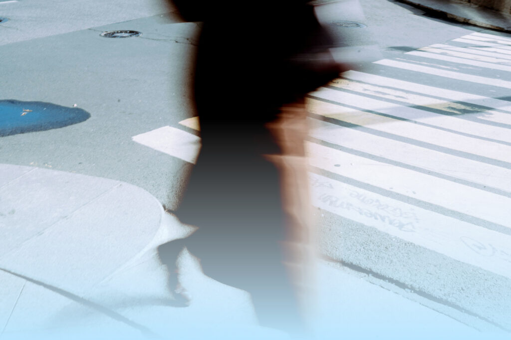
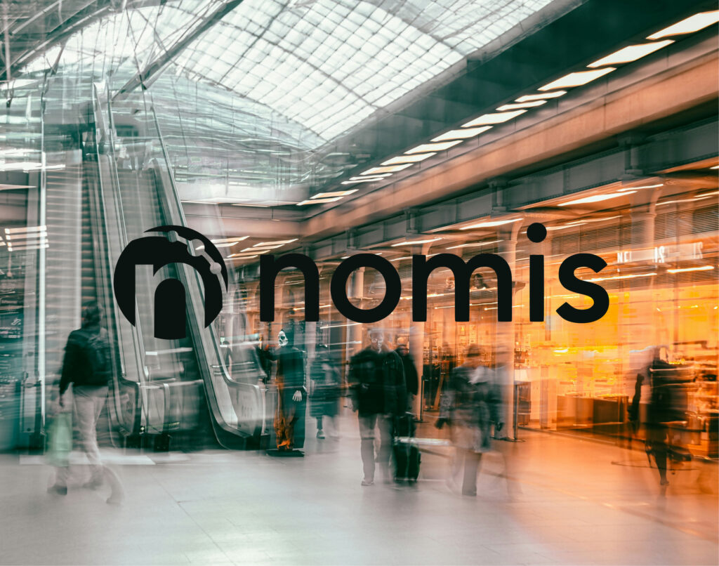
Photo Styling
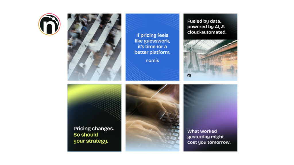
The visuals from our photography bank include mostly a blur - motion style to represent how money is constantly changing & evolving in the market. Use this bank for photos on any collateral and please make sure that photos chosen represent our palette as closely as possible.
For styling, it is also acceptable to overlay a clarity sky gradient on top of the image to ensure brand color consistency. Please only apply the gradient from bottom to top, with transparency enabled for the photo to still be visible.
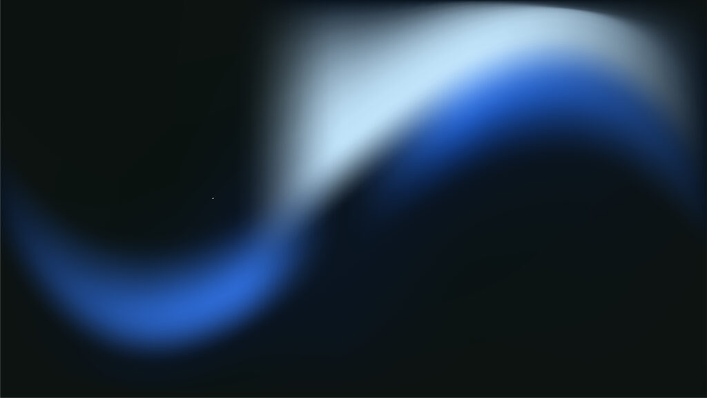
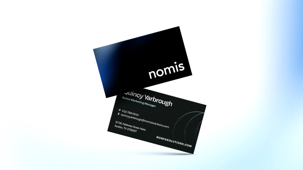
Mesh Gradients
Our mesh gradients are a visual expression of futuristic innovation and confident simplicity. Inspired by fluid motion and seamless transitions, they embody Nomis Solutions’ role as a forward-looking partner in financial markets. These gradients can be used as textures and backgrounds for marketing materials like business cards, websites, and one-pagers.

Line Work
Our line work speaks to the precision and data-driven identity of Nomis. These are perfect for adding texture and depth across digital and print materials.
Icon Bank
Our custom iconography system is cohesive with our line art and brand system. Use these icons for any marketing materials and website usage.
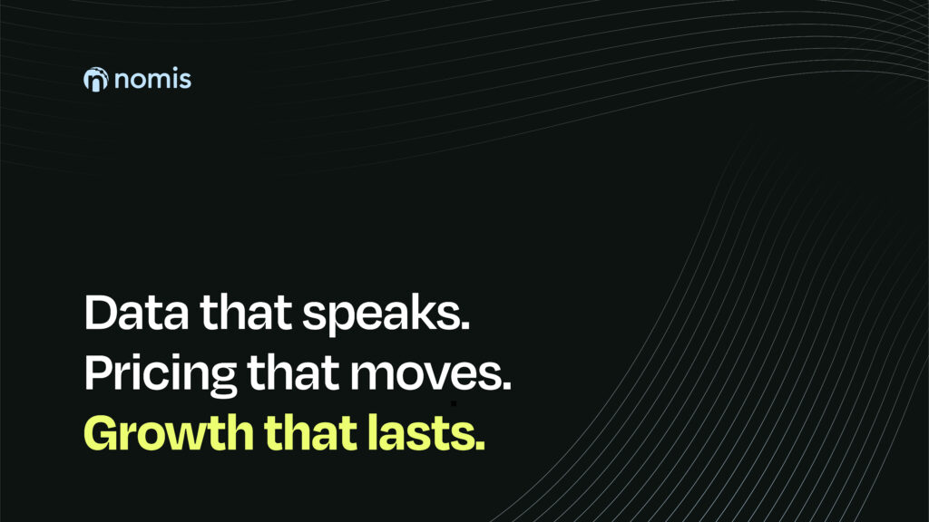
Brand in action
Application